Empower GENNOW
Responsive Website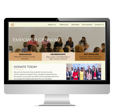

The organization had a website already, but they needed a complete visual redo. They desired a refreshed look and feel to the website.
Design a product that was both visually appealing and encouraged members (both current and prospective) to find information quickly and simply using the organization’s desired branding and style preferences.
Design a responsive website with a heightened focus on memberships and viewing the variety of resources available to people in the community.
It is important to note that while there are several possible user flows for this particular website, these were the primary focuses.
I was the Lead UI/UX Designer on this project. I created a user persona, mapped out the user journey, and created the sitemap. I led and executed the design direction based on the color palette and style preferences that were provided by Empower GENNOW. I also created a reusable design system and the final mockups for the web developer.
Competitor audits, wireframing (paper and digital), account for accessibility needs, iterate designs based on stakeholder feedback for responsive design
June – October 2022
Empower GENNOW, is a non-profit community based organization with a mission which strives to build and leverage a diverse and inclusive workforce for young professionals and youth in Greater Cincinnati. This has been made available through professional development, training, job placement, and the creation of leadership and mentorship opportunities through networking.
After reviewing the current pages and performing a competitive audit, I wanted to see if any pages could be grouped differently based on my findings from my site and competitive audits. Since the client only requested mockups of key pages (rather than the entire site), the sitemap was an excellent way to see which pages needed to be mocked up now, and which ones could wait a little bit longer. With key pages in mind, I began to ideate ideas.
I used the "How Might We?" exercise to generate potential solutions for these pages. Some designs were better than others, I will admit, but it allowed me to decide which wireframes could be translated into digital mockups for Empower GENNOW to review.
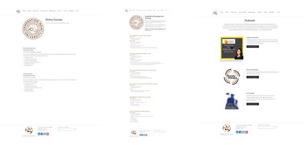
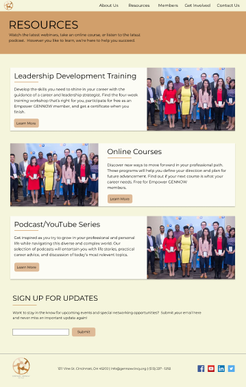
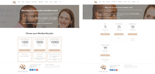
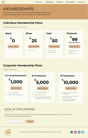
During the Design Process, I saw an opportunity to reimagine the Memberships and Resources pages. These pages did not have a lot of copy on them and instead relied on the user to instinctively click on a page within the top navigation. I combined information on these pages and reimagined them to make them the one-stop-shop for anything related to Memberships and Resources.
To make sure my design met user needs at every stage in the Design Process, I created a user persona before I started any design work. Creating a fictional user who has similar needs to a much larger group allowed me to ensure that my designs were always focused on the user at every stage of the Design Process.
Initial feedback from stakeholders at Empower GENNOW was good, however, they mentioned that the white backgrounds on the pages was too much, and requested to find a softer color. While having some white on a page is perfectly alright, having a large amount whitespace can create too much contrast. In some cases, too much whitespace can cause eye strain and become uncomfortable to read. After reviewing several potential options, I was able to find a color to use in place of the white backgrounds. I ensured that this color complemented the existing color palette.
I used feedback from Empower GENNOW throughout the Design Process and continued to iterate on the final mockups until all requests were fulfilled and I was happy with each design.
Color contrast checks were performed frequently throughout the Design Process to make sure all color combinations passed accessibility guidelines.
Design should be compatible with screen reader technology to assist any visually-impaired users (this step would be completed by the web developer).
HOMEPAGE
Before
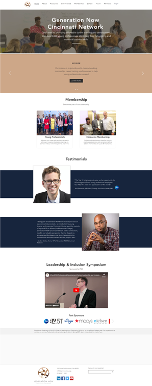
After
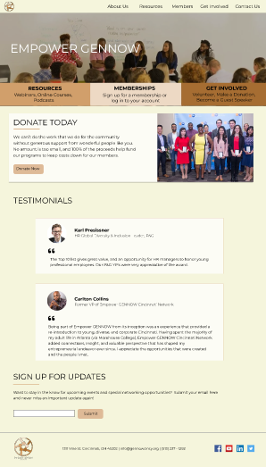
RESOURCES
Before
After
MEMBERSHIPS
Before
After
I volunteered my time and resources to redesign this website for a nonprofit group in Cincinnati called Empower GENNOW. Since this was a volunteer project, Empower GENNOW was able to save the money they would’ve spent on the website redesign and put it towards other initiatives. This design received positive feedback from the CEO. The web developer appreciated having a complete design system to work off of as well as a layered file in Figma. By providing these assets upfront, the web developer was able to get up and running much faster, which saved countless hours overall.
By planning ahead and creating a problem statement, user persona, and a sitemap, it was much easier to determine several things: what pages needed to be designed, how that information should be organized on the website, and making sure the user was always top-of-mind in every stage of the Design Process.
I met with the web developer and gave him the sitemap, final mockups, photos used throughout the design, sticker sheet, and design system. As stated previously, by providing these assets, this ensured the web developer had the right tools to quickly and accurately recreate the website and push it live when it was complete.
I would recommend that another usability study be performed before the new site is relaunched to ensure that the user flows remain smooth and any pain points that arise are addressed quickly.