Have a Seat
Mobile App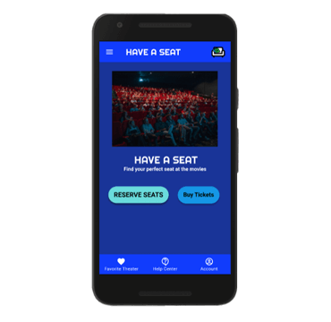

Guests who want to reserve seats in advance before arriving at the movie theater.
Design an app that was both visually appealing and easy to use among movie theater guests.
This app was designed for guests who have already purchased movie tickets and wanted to reserve their seats in advance.
I was the project lead on this assignment. I mapped out the user flow within the app, led the design direction, and conducted research among potenial app users.
User Research, Wireframing (paper and digital), Prototyping (low and high-fidelity), Accounted for any accessibility needs, Iterate prototypes and wireframes based on guest and peer feedback
October 2021-November 2021
The intent was to build an app that people would use – and would enjoy using. By conducting user research early and often, this allowed us to always put the user front and center in the design process. Empathy maps were implemented to connect with users and their needs. A heightened area was on guests with disabilities and their caretakers. Unmoderated usability studies were conducted to find out how easy the app was to use and uncover any potential pain points that were not considered in the ideating and design phases.
We always need to be mindful of guests with disabilites who visit the movie theater. By being mindful of their needs and anticipating any requests, it will create an enjoyable experience for everyone involved.
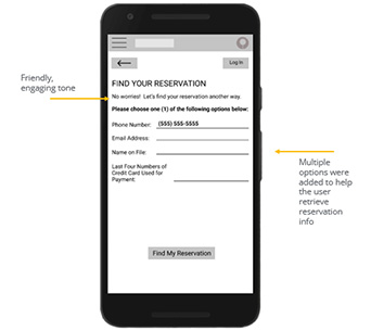
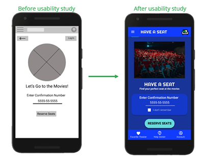
Many users were concerned that if they didn’t know their confirmation number that they couldn’t use the app. By giving alternative options, I was able to correct this pain point quickly.
Many guests liked the prototype so much, they asked if they could set up an account to store their information. An Account section was created by popular demand.
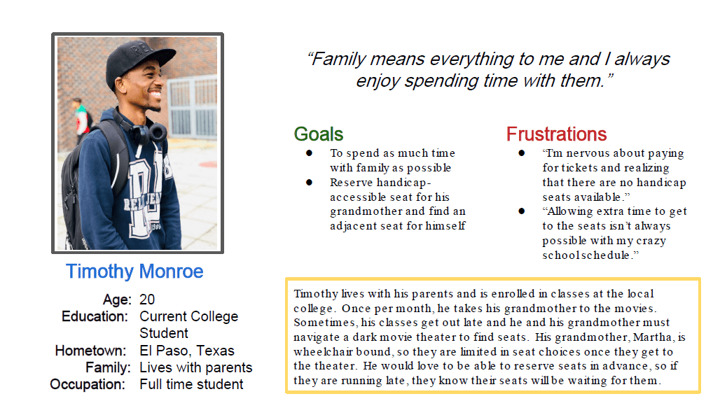
Timothy is a college student who needs to reserve handicap-accessible seats in advance because he wants to enjoy movies with his grandma and not worry about seating for her.
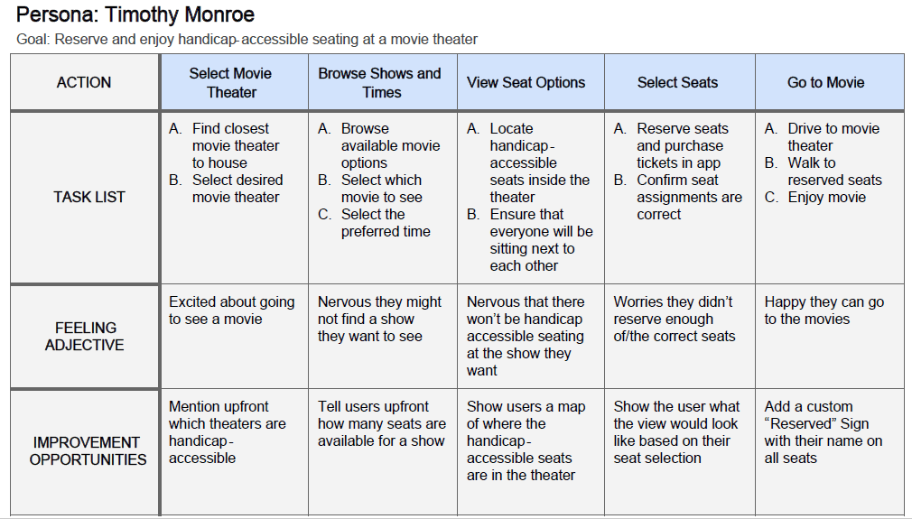
This was a very eye-opening exercise when I realized how many steps (and emotions) were involved in an activity like visiting a movie theater. By being aware of these thoughts and emotions, it became very easy to put the user needs front and center.
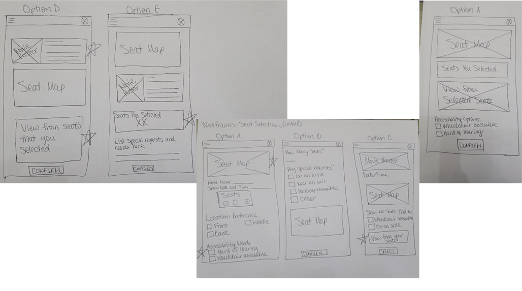
Paper wireframes allowed me to quickly sketch out ideas on what the seat selection page could look like. The goal was to make this page very visual with supporting text, where appropriate. Anything marked with a star means that it was incorporated into a later design.
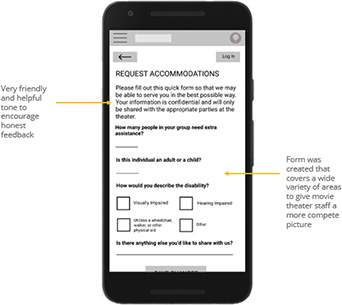
Many users felt the previous title ("Need Assistance") was too broad and confusing. A wireframe was made so guests could privately elaborate on what type of assistance they needed at the theater.
Furthermore, many users expressed concern about having to remember another confirmation number, and would prefer another option to retrieve a reservation. This screen was created to give users a choice on how they wanted to retrieve their information.
Two rounds of usability studies were conducted. The first one was done with a low-fidelity prototype to guide the designs through the wireframe and prototyping phases. The second one was done with a high-fidelity prototype to uncover which parts of the design needed to be polished.
Participants would like more clarity around options for guests with disabilities.
Guests would appreciate different ways of retrieving their reservation information.
Users expressed an interest in interactivity regarding the seat map.
Revisit the user flow regarding account settings in the app.
Create a clearer call-to-action regarding reservation lookup.
Refine user flow experience in the app regarding guests with disabilities.
The confirmation number screen was refined to include a clear call to action for those who couldn’t remember their number.
The Guests with Disabilities section on the Select Your Seats was reimagined to be more inclusive, yet specific.
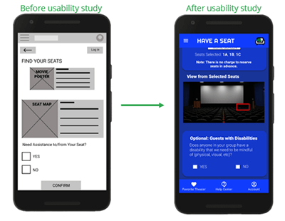
When the color palette was chosen for this project, an emphasis on high-contrast was top of mind. This ensures anyone with a visual disability would be able to use the app.
This was designed to be successfully read by a screen reader.
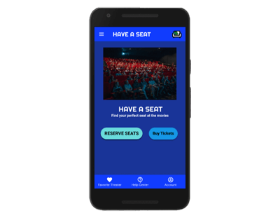
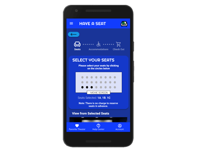
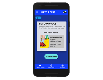
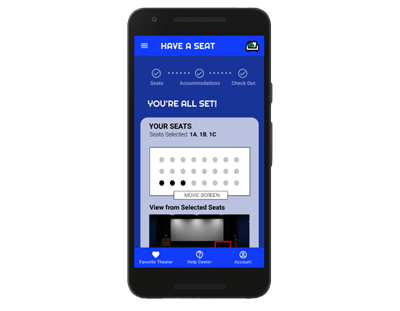
Although the main user flow centered around reserving seats, I also accounted for other flows that might be important (such as Account Information).
Click here to view the high-fidelity prototype.
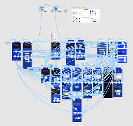
The app makes the user feel like the movie theater is not only catering to people who want to save time, but also to those who might extra assistance at the theater.
One quote from peer feedback: "Well done! The confirmation page had a good timed transition that I appreciated."
Throughout this course project, I learned that it’s ok to tweak a design as you go based on feedback ("nothing is set in stone"). Usability studies were valuable pieces of information that I had to ensure the user always came first in my designs.
Conduct one final usability study to ensure all pain points are addressed and the user flow remains smooth.
Work with Engineering Team to bring this app to live and market it to current and future movie guests.
Please Note: This case study was completed as a part of the Google UX Design Professional Certificate Program offered through Coursera. All characters described within the study are fictional. Any similiarity to actual persons, products, and/or experiences is purely coincidental.