Pawprints Animal Shelter
Responsive Website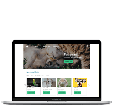

Streamline the process of finding an animal that was available for adoption and making an appointment to meet the pet in person.
Designing a responsive website that users wanted to use to search for available pets – and make the website itself visually pleasing in appearance.
Design a responsive website for a local animal shelter with a heightened focus on the pet adoption process. The target audience was anyone in the community actively looking to adopt a pet.
I was the UX designer on this assignment. I mapped out the user journey on the website, led and executed the design direction, and created a reusable design system.
Competitor Audit, User research, Wireframing (paper and digital), Prototyping (low and high-fidelity), Accounted for accessibility needs, Iterate prototypes based on stakeholder and user feedback for responsive design
November – December 2021
The intention behind this project was to build a responsive website that not only served a large user need, but also make the website visually pleasing and enjoyable to use. Empathy maps were created and implemented to better connect with the needs of the user. By placing the user front and center in this manner, this guaranteed that the user would always remain top of mind throughout the design process. Unmoderated usability studies were conducted to uncover any potential pain points that were not considered during the ideating and design process. Feedback was incorporated into the final prototypes.
We realized that adoption fees aren’t listed anywhere on the website, which led many users to think that all the animals were free. This told us we need to list cost anytime we describe the animal.
Users prefer a final chance to make sure their selections are correct before submitting their request.
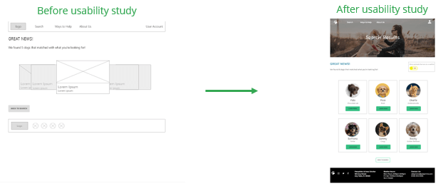
Users indicated they wanted search results displayed in a clearer way, specifically, how the results were displayed in the browser.
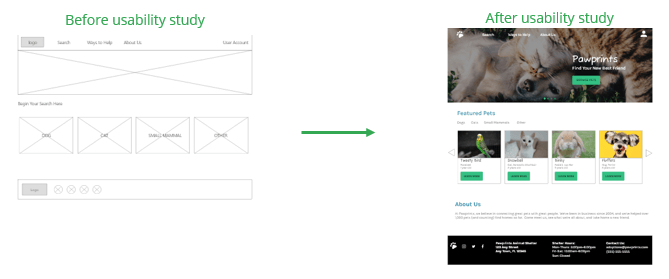
Some users had difficulty finding the Search feature on the homepage, so we made it more pronounced above the fold.
Mary is a teacher and animal lover who needs to view available pets for adoption online because she would like to adopt a pet and take it home with her that day.
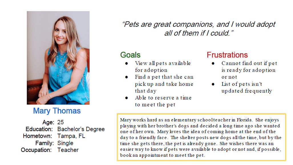
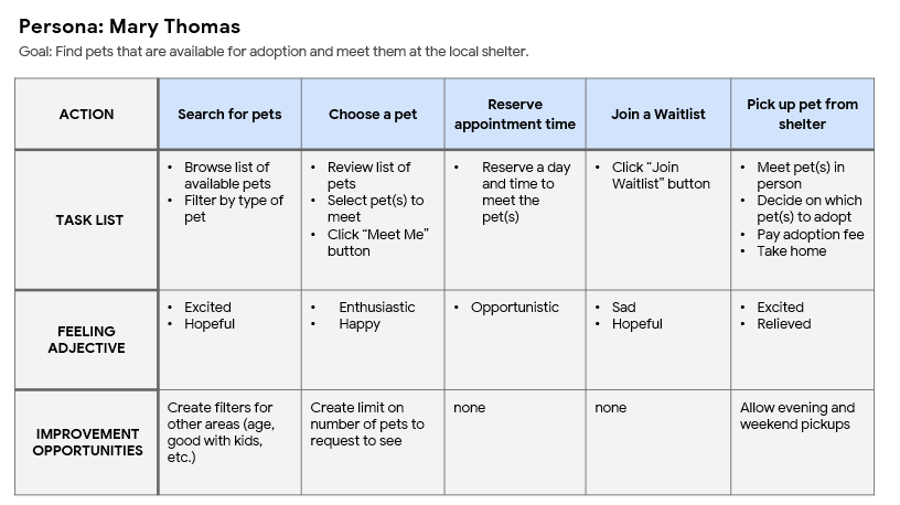
The intention was to think through not only the steps a user would take in the adoption process, but also the emotions that go into each of those steps. This was a very eye-opening exercise and inspired me to create a website that met Mary’s needs every step of the way.
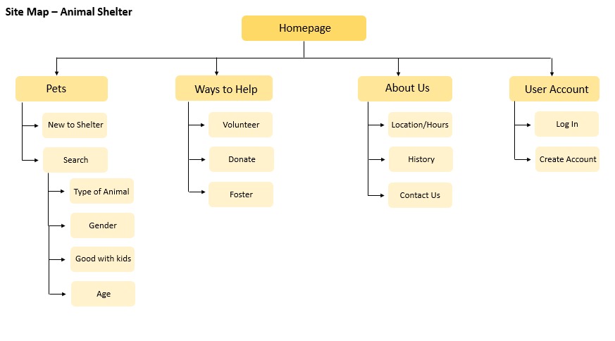
My goal was to lay out the information architecture in a way that would benefit users the most and, in turn, improve the overall website experience. It allowed me to organize similar topics into groups - and was very helpful as I began to ideate in the design process.
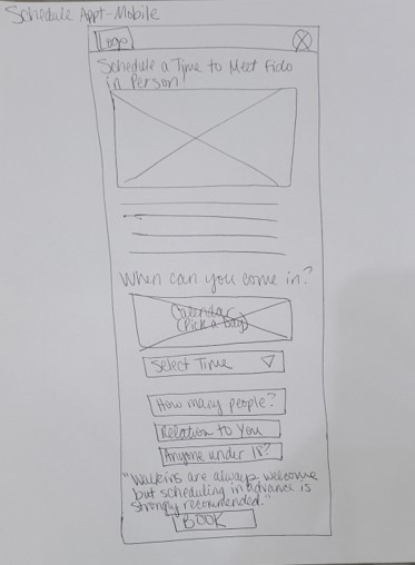
I liked creating paper wireframes first because it allowed me to quickly ideate potential solutions. It also allowed me to see which concepts could be translated into digital prototypes.
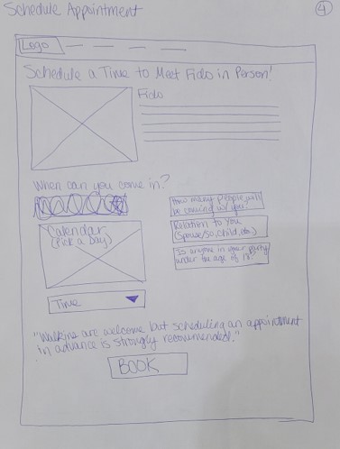
By ideating for mobile devices as well, this allowed me to make sure the most important parts of each webpage stayed above the fold and any calls-to-action were clearly marked.
The primary focus for this website is streamlining the animal adoption process - and prioritizing that topic on the homepage was a large part of my strategy.
Many users expressed concern that the Search feature in the navigation menu was too small, so a second button was added on the hero image. Now there are two ways to access the Search feature.
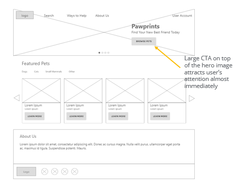
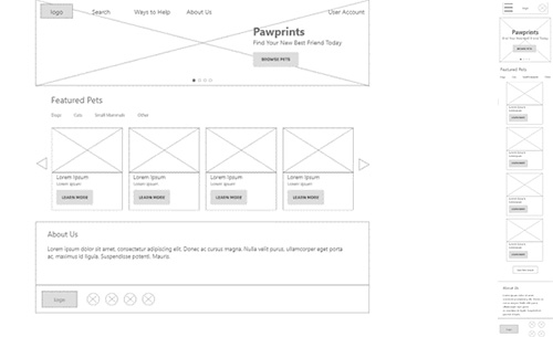
Since this is a responsive website, I wanted to create wireframes for various screen sizes - and make sure that both the Search button and link always remain above the fold.
An unmoderated usability study was conducted to find out if the main user flow (finding a pet and making an appointment) was easy for users to complete. It was also conducted to see if there were any pain points that weren't previously considered.
Participants would like another reminder on the adoption fee. On the confirmation page, many users forgot how much the fee was.
Users told us they wanted to choose a time to meet the pet at the shelter (instead of listing day only).
Users want to be able to select the type of animal first before getting into specific details (such as age and gender).
Many users skipped over the Search feature simply because they couldn’t find it. A large call-to-action was created on top of the hero image. The Search button remained in the top navigation to serve as another way that users could begin their search.
Many users didn’t like how animal pictures “overlapped” on the page. The page was reimagined, so all animals, their names, and types were visible on the page - with no extra effort on the user’s part.
Color contrast remained very high on the page, to account for any users who might be color blind.
Visual hierarchy was created by using headers of different sized text.
Design will be compatible with screen reader technology to assist any visual-impaired users (this step would be completed by a member of the Engineering Team).
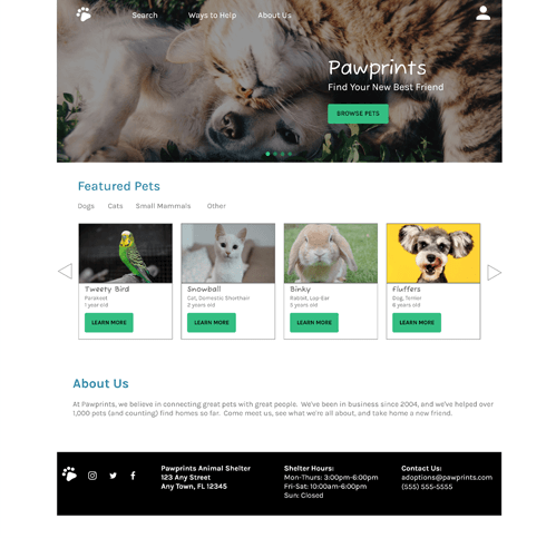
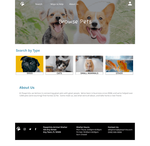
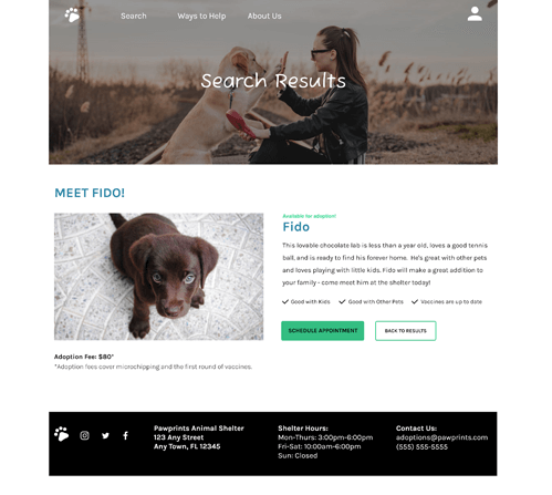
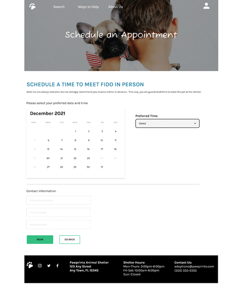
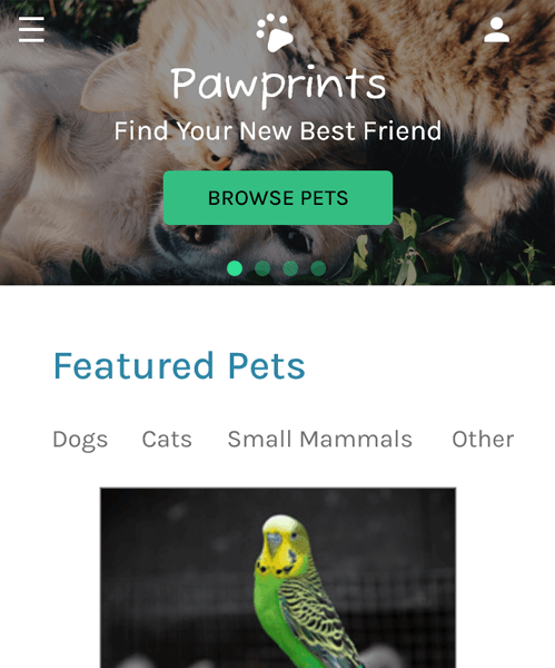
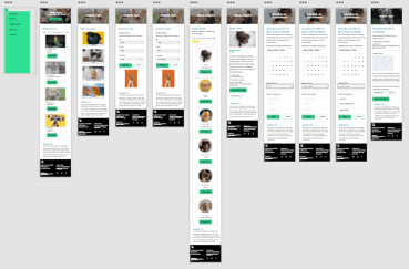
Many versions of the same screens were built because it is widely known that users access websites from a variety of devices – such as desktop and mobile. This gives users additional ways to access the website and view pets that are available, no matter where they are. By giving users these options, this helps improve the overall user experience.
Desktop

Mobile
Color palette, typography, and animations were incorporated into desktop and mobile designs. Important calls-to-action were built with high-contrast colors to make them stand out for everyone. High-fidelity prototypes were created to show stakeholders how the website would look and behave if it was live in a browser.
Click here to view the high-fidelity prototype for desktop devices.
Click here to view the high-fidelity prototype for mobile devices.
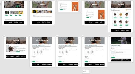
This website was designed and completed as part of an online course. Feedback I received from my peers was very positive and encouraging.
I learned that a sitemap and a well-crafted problem statement make the design and ideation process much more streamlined. I also learned that it’s perfectly ok to change certain parts of a design as new ideas and feedback come to light. Finally, a well-organized design system makes designing easier, faster, and more consistent.
I would ensure all accessibility issues are addressed and corrected (if any new ones arise).
I would consider setting up another usability study with different participants to make sure the user flow is still smooth and no pain points come up.
If this were a real project (and not part of a course), I would either begin to code this myself or give the final design to the Engineering Team – and help them out where needed.
Please Note: This case study was completed as a part of the Google UX Design Professional Certificate Program offered through Coursera. All characters described within the study are fictional. Any similiarity to actual persons, products, and/or experiences is purely coincidental.