Safe & Sound
Mobile App and Responsive Website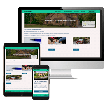

The number of extreme weather events continues to climb every year. Many people within one Homeowner's Assocation (HOA) expressed concern with the fact they wouldn’t know what to do – or how to ask for help – if extreme weather struck the area unexpectedly.
Design an app and website to educate homeowners on what they can do to protect themselves and their homes – as well as give/receive help in the community.
I created a dedicated mobile app and a responsive website that ensured all members within a community were protected in the event of extreme weather. The target audience was members of a homeowner’s association (HOA).
I was the lead UX designer for this project. I lead the design from the initial stages all the way through to the final products.
Competitor audit, user research, wireframing (paper and digital), prototyping (low and high-fidelity), iterating designs based on user feedback, accounted for accessibility needs, and crafting information architecture.
December 2021 – January 2022
An unmoderated usability study was conducted with 5 homeowners in the community. The age range is quite wide, so I wanted to do studies with older, as well as younger members. These select group was shown the low-fidelity prototype and encouraged to provide honest feedback.
I realized that while the homeowner checklist was easy to find and navigate (and appreciated), there was not a lot of emphasis placed on asking for help or volunteering. This was an error that had to be corrected immediately in future designs and prototypes to make sure everyone was taken care of.
Homeowners unanimously said that they wanted a way to volunteer in the community. This user flow was created immediately by popular demand.
Users wanted to see how far along they were in the Homeowner Checklist section.
Our participants stated that it was not easy to request help within the app.
Some users said there was an overwhelming amount of copy on some screens.
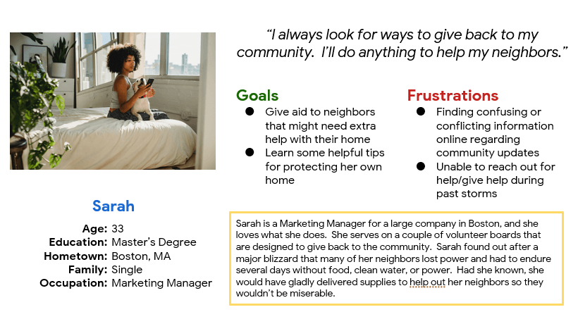
Sarah is an active volunteer who needs to see who in her neighborhood who needs help preparing/recovering from bad weather because she wants to be proactive and help her neighbors get back on their feet.
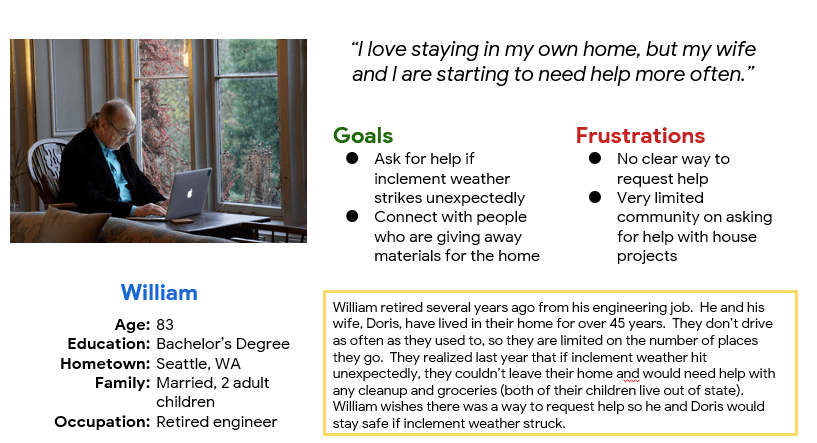
William is a retired, elderly homeowner who needs to quickly and easily request help from neighbors because he would like to be sure his home is ready for any upcoming bad weather.
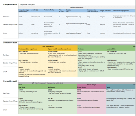
I wanted to see how competitors portrayed themselves regarding disaster relief and how to help others. Some competitors didn’t have calls-to-action that met accessibility guidelines, so I wanted to make sure all items in my designs were accessible. Also, navigation on all platforms was easy to navigate and clear to understand. This was a heightened focus when I started the designs for my project.
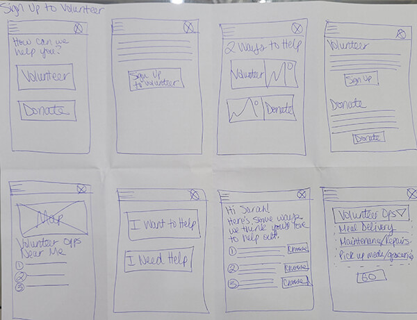
I used the Crazy Eights exercise to quickly ideate potential solutions for the key steps in the User Journey. My initial designs for the Volunteer section are pictured here.
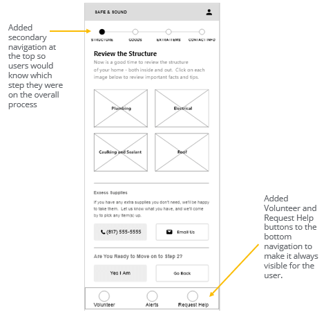
The thought process behind the design was to make the app page more visually appealing without sacrificing any important data that the user might need to know. I added a sticky navigation to the bottom and included the things a user might search for the most.
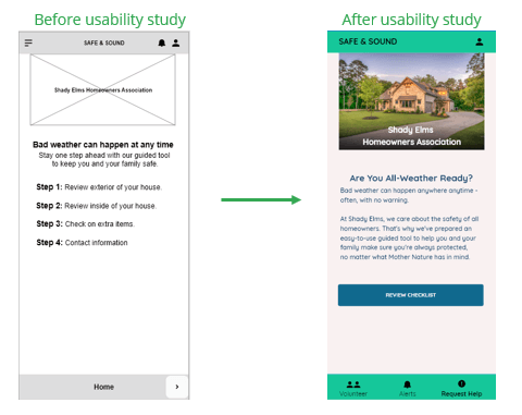
An unmoderated usability study was conducted to find out if the main user flow (making sure your family and your home are protected from extreme weather) was easy for users to complete. It was also conducted to see if there were any pain points that weren't previously considered.
Several users wanted to be able to "check off" a task once they were finished viewing it.
Users unanimously wanted a clearer way to be able to volunteer in the community.
Users liked the idea regarding asking for help but indicated they did not know how to do that in the app.
Many users said they could not easily find a way to volunteer or ask for help. Based on this feedback, the bottom navigation in the app was reimagined so these features would always stay visible, no matter what screen the user was on. On larger screens, these buttons were moved into the top navigation.
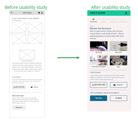
Many users indicated that there was too much copy on some of the screens in the app. To make it more visually appealing, the copy was reworked or removed, and popups were added if a user clicked on a specific item (example: Plumbing or Electrical).
Color contrast (especially on buttons and in the navigation menus) remained high so that users who were visually impaired could still navigate through the website and/or the app.
I would let the Enginnering Team know what steps to take to ensure the app and website would work well with a screen reader.
Descriptive alt text would be added to each image before the designs go to the Engineering Team.
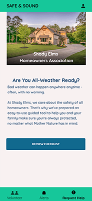
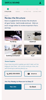
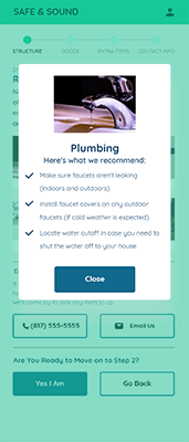
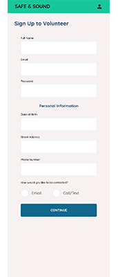
Color palette, typography, and animations were incorporated into desktop and mobile designs. Important calls-to-action were built with high-contrast colors to make them stand out for everyone. High-fidelity prototypes were created to show stakeholders how the website would look and behave if it was live in a browser.
Click here to view the high-fidelity prototype for the app.
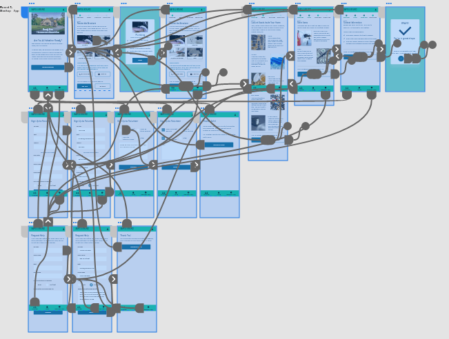
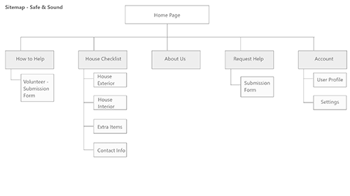
With the app designs finalized and approved, it was now time to shift my thinking towards the responsive website. The thought process was to see what pages would be needed for the responsive website and see if there were opportunities to group similar pages together within the top navigation.
Text and images were resized based on screen size. Negative space was used more frequently as screen size increased. This was done to keep the user’s attention focused on the primary content.
This was done as part of a course project; however, if this were a real-life project, this would make it much easier for homeowners to protect themselves and each other in the event of extreme weather. It would also make it very easy for people who need extra help to get it before disaster strikes. I got positive feedback from my peers regarding the designs.
I learned that it’s ok to have multiple user flows in the same project. I also learned that making a step in the user flow easier for one specific user type makes the design easier for everyone to use.
I would consider another unmoderated usability study with the high-fidelity prototypes to make sure users can successfully complete one of the user flows successfully (homeowner checklist, volunteering, or asking for help).
I would clean up and finalize the Assets panel in Adobe XD, so the Engineering Team can find the specs quickly and easily.
Please Note: This case study was completed as a part of the Google UX Design Professional Certificate Program offered through Coursera. All characters described within the study are fictional. Any similiarity to actual persons, products, and/or experiences is purely coincidental.